Understanding the Health Overview Chart
This article outlines what the Health Overview chart is, how you can access it, and how it helps you.
Why is it useful?
This chart is primarily designed to help you identify trends and potential issues in your equipment. These may include when the asset is consistently running or not-running, and at what time during the day or week an asset is experiencing changes in condition.
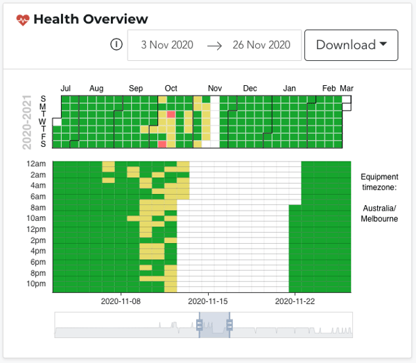
How? Let's take a look at the example chart below:

On this chart, we can clearly see that each day, between roughly 10 pm and 5 am, the asset is not running. Further, we can see that it is routine for the asset to be not-running on weekends (the consistent 2 or so days of not-running breaking up the month).
Here, we thus have a record of when any deviations from these patterns took place, but more importantly, we have an understanding of the optimal times to perform maintenance.
What's more, the chart identifies a clear pattern; upon getting the asset up and running each morning, it consistently experiences a deviation from its normal operating behaviour.
Further, another key functionality is that, as highlighted earlier, the chart displays any and all changes in the asset's condition, not just the alarms.
Of course, these are just some examples of the value you may derive from this chart. Ultimately, you can use the information these charts provide in whatever way, shape or form best suits you.
What is the Health Overview chart?
This chart brings together an asset's 'normal', yellow and red samples to visualise the asset's condition over its lifetime.
This can be seen in the calendar across the top, which provides a monthly overview, or the chart below, which displays daily and hourly health for the set dates.
Through the colour of each block, the chart highlights whether an asset was running or not-running, and the health of that asset on each given day and hour.
For instance, if a block is white, that indicates not-running. If a block is green, the asset was running within its normal operating behaviour. Yellow indicates your asset was showing a minor deviation in condition, and red indicates there was a major deviation.

Please note however these colours do not indicate when alarms were triggered.
Yellow advisories are triggered when 3 yellow samples are received consecutively, and likewise red alerts are triggered when 2 red samples are received consecutively. Thus, in a block of time that is yellow, for example, only 1 or 2 samples of minor deviation may have been received - not enough to trigger an advisory. In this way the chart allows you to see, at a glance, when your asset experienced any changes at all, not just those that triggered an alarm. If you would like to see if an alarm was triggered however, the AI Output graph below includes alarm markers.
To the right of the chart the Equipment Timezone is included too. This is the timezone of the FitMachine/Device in question, NOT the timezone of your browser.
How do I access it?
The Health Overview chart can be found on any asset's Equipment Detail View, under the 'Charts' tab. It is the first chart on your screen.
By default, when you click on an asset, the 'Charts' tab should be automatically selected. If not however, simply click it.
Please see the image below for reference:

---
Thanks for reading. As always, if you have any questions or concerns please reach out to MOVUS Support here.